Graphic design is a captivating journey through the intersection of creativity and communication. However, even the most skilled designers can fall prey to common mistakes that hinder the impact of their work. Let's explore some prevalent design pitfalls backed by facts and examples to highlight the importance of avoiding these missteps.
Neglecting The Brief:
As designers, sometimes all we want is ample projects at the same time for monetary purposes and to upgrade your niche section for the portfolio. Still, at times, we need to remember to deliver qualitative graphics or videos to our clients, which can be a blaster, and we might end up losing the clients.

Ignoring White Space:
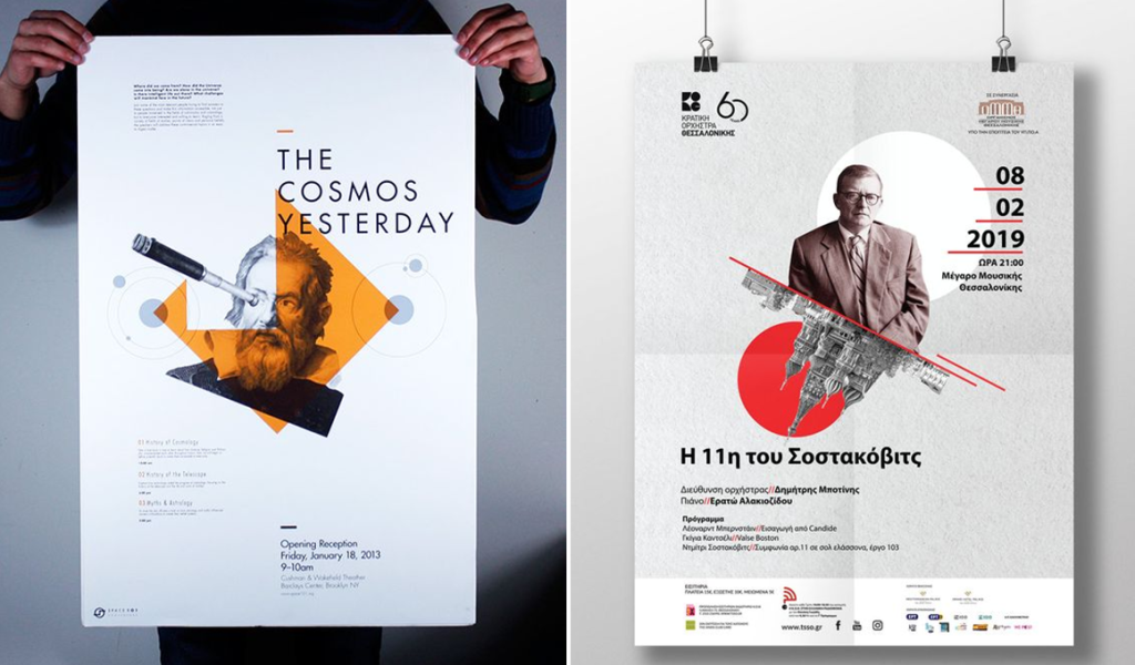
White space is the most important element in any graphics; once you know where to add white space and how to use it, then you can interact with your audience at max level, but when you commit to the delivery of the graphics, at times, we forget to use the white space. Try to english your focus with your creativity and deliver the main message of the image.

Inconsistent Branding:
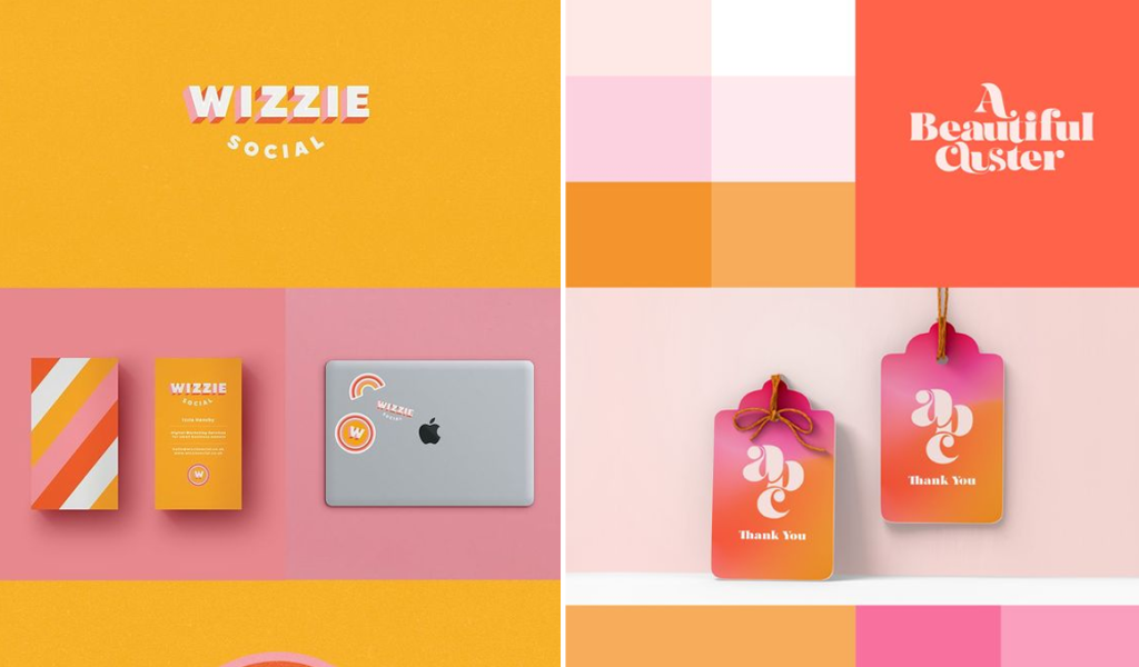
Inconsistent branding refers to when you are irregular with your aspect of building a portfolio or submit your daily task at office. It happens when you aren't aligned with your timelines and deadlines. It can turn your creativity into an opposite side where you aren't able to focus on the real quality, upgrading with new tips and tricks. Still, somewhere, you got stuck in the backlog on submitting your deliveries due to over-commitment.
Overlooking UI:
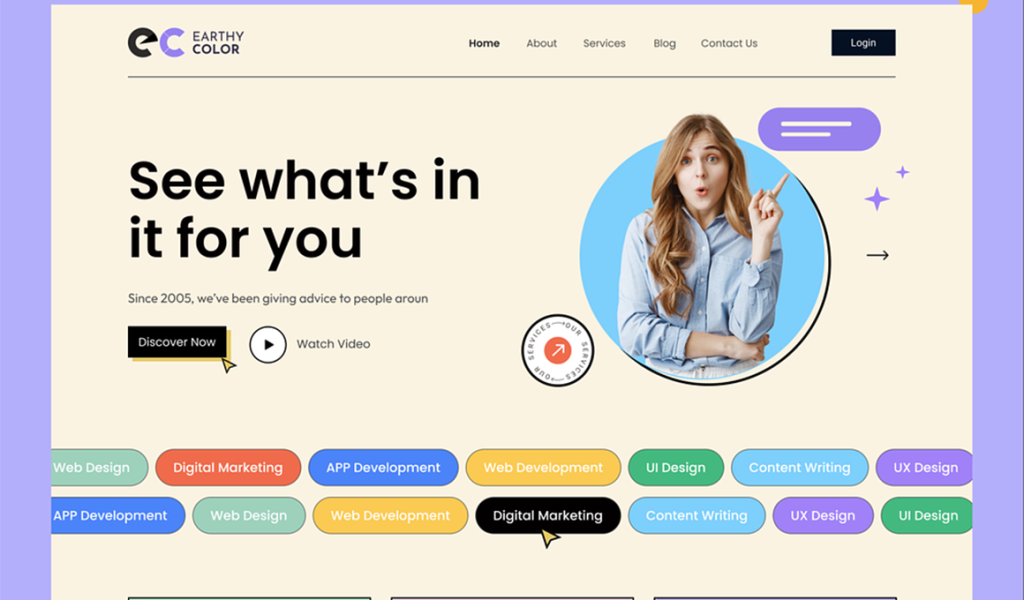
All the designers know breathing and white space where you add a perspective to the viewer. Still, many times, we are not able to showcase it properly because we have to write and update all in one design, and the best thing where you can ad focus on is when you can plan prior and then focus on executing the curated plan.
Ignoring Resolutions:
For any graphic, make sure you add high resolution to the pixels because many times, pixels can tear down into a blurry one. So make sure the resolution is correct as per the size and platform on which the image will be displayed.
Excessive Use of Stock Graphics:
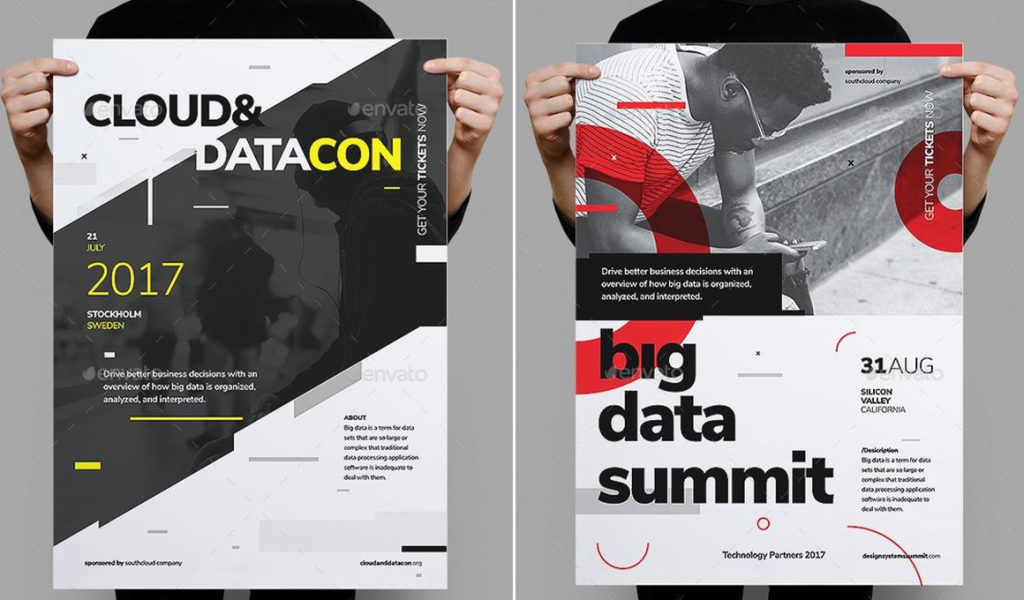
These days, we have tons of platforms on which stock images and videos are available for external use, and we have many designers who only stick to stock images without creating art from scratch. Try to use stock graphics with your creativity and then hand over the project to the client.
Color Clashes:
So, color clashes or mismatching of color theories in a graphic can make any image dull and of low quality. So, use the correct color theme to embrace the image and make it more likable to the users.
Lack of Feedback and Revision:
So feedback is the key and revision of mistakes in a correct manner is the golden opportunity for the graphics, which helps them improve their thought process and usage of tools and software. So try your best to get as much as possible; it helps you to create the best and to determine your mistakes.

Using Trends Without Purpose:
As we all are aware, marketing depends on the trendy things and trends that follow, which makes anything a big hit or dark flop; at the same time, it always looks after which trends are useful to follow and which aren't. Put your energy into the right move to get the best useful outcome.

Conclusion:
Learning from these common design mistakes, supported by facts and examples, is essential for designers aiming to elevate their craft. By staying informed, receptive to feedback, and mindful of the impact of design choices, professionals can create visuals that capture attention and effectively communicate messages meaningfully.


