As a graphic designer, a complete graphic is a harmonious fusion of art and communication. It's not merely a visual composition but a purposeful arrangement of elements that conveys a message, triggers emotions, and leaves a lasting impact. A complete graphic is a work of artistry and strategy where every color, line, and pixel serves a deliberate purpose. It reflects meticulous attention to detail, a commitment to clarity, and an unwavering dedication to capturing the essence of a message in a visually captivating way. In this perspective, let's delve into the key components that transform a design into a complete graphic.
Creating a Perfect Graphic: A Comprehensive Guide
Tables are a fundamental component of graphic design, serving as versatile tools for organizing and presenting data, information, and content in a structured and visually appealing manner. Whether you are designing a report, a website, an infographic, or any other type of visual communication, including well-crafted tables can greatly enhance the clarity and effectiveness of your message. In this guide, we will explore the key elements and best practices for creating a perfect graphic table that conveys information effectively and adds to your design's overall visual appeal.

- Table Structure:
The foundation of a perfect graphic table lies in its structure. Before you start designing, carefully consider the following aspects:

- Columns and Rows: Determine the number of columns and rows needed to organize your data logically. Avoid excessive rows and columns, as they can clutter the table and overwhelm the viewer.
- Headers: Include clear and concise headers for each column. Headers should accurately describe the data they represent and be easily distinguishable from the rest of the content.
- Spacing: Pay attention to the spacing between columns and rows. A well-balanced layout ensures the table is easy to read and aesthetically pleasing.
- Consistent Styling:
Consistency in styling is essential for creating a polished and professional-looking table. Consider the following design elements:

- Typography: Use a legible font for the text within the table. Ensure that the font size is consistent and appropriate for the content.
- Alignment: Maintain consistent text alignment within the table. Typically, data is aligned left, headers are aligned center, and numeric data can be aligned right for better readability.
- Color: Choose a color scheme that complements the overall design but doesn't overshadow the data. Consider using subtle shades for alternating rows to improve readability.
- Data Presentation:
The primary purpose of a table is to present data effectively. Follow these guidelines to enhance data presentation:

- Data Hierarchy: Organize data hierarchically, placing the most important information in the top row or leftmost column. Use bold or italics to emphasize key data points.
- Use of Icons and Symbols: Incorporate icons and symbols to represent specific information or actions, adding visual interest and clarity to the table.
- Conditional Formatting: When applicable, apply conditional formatting to highlight data trends or outliers. Color coding can draw attention to specific values.
- Accessibility and Responsiveness:
In today's digital age, it's essential to ensure that your table is accessible to all users and adapts to various devices and screen sizes:
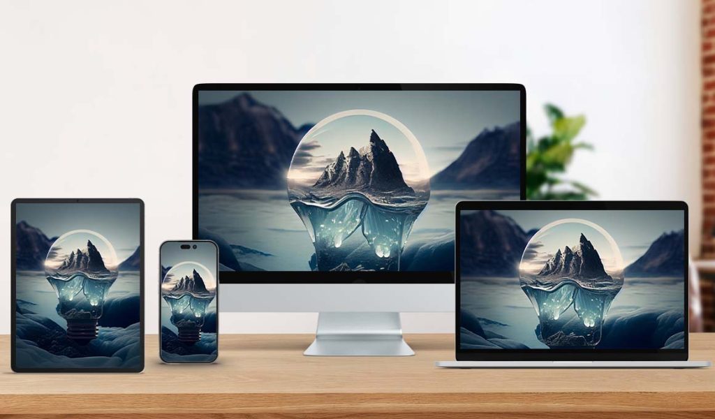
- Alt Text: Provide descriptive alt text for data tables in digital formats. This assists users with visual impairments who rely on screen readers.
- Responsive Design: Design your table to be responsive, allowing it to adapt to different screen sizes without sacrificing readability. Utilize media queries and CSS techniques for optimal responsiveness.
- Testing and Feedback:
Before finalizing your graphic table, it's crucial to conduct thorough testing and gather feedback:

- Proofreading: Double-check all content, headers, and data for accuracy and consistency. Eliminate any typographical errors or inconsistencies.
- Usability Testing: Invite users to interact with the table and provide feedback on its clarity, ease of understanding, and overall usability.
- Cross-Browser Compatibility: Ensure the table functions and displays correctly across various web browsers and devices.
- Feedback Iteration: Use feedback from users and stakeholders to make necessary improvements and refinements to the table's design and content.
A perfect graphic table is more than just a collection of rows and columns; it is a strategic arrangement of data that serves both as an effective information delivery tool and a visually appealing design element. By carefully considering structure, consistency, data presentation, accessibility, and feedback, you can create tables that enhance your graphic designs and provide clear and meaningful information to your audience. Whether in print or digital media, crafting the perfect graphic table is valuable for any graphic designer.
A Theory of Complete & Incomplete Graphic
As a graphic designer, I view a complete graphic as a harmonious blend of various elements to convey a message effectively and aesthetically. Here are the key aspects that contribute to making a graphic complete:

1.Clarity of Message: A complete graphic delivers a clear and concise message to the viewer. It avoids ambiguity and effectively communicates the intended information or idea.

2.Visual Balance: Achieving visual balance is crucial. This involves distributing elements (text, images, shapes, etc.) to create visual equilibrium. A balanced design is pleasing and draws the viewer's attention to the right places.

3.Consistency: Consistency in design elements such as color schemes, typography, and spacing ties the graphic together. It ensures that the design looks cohesive and professional.

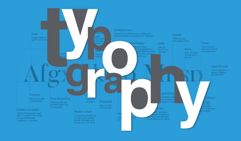
4.Typography: Typography plays a significant role. A complete graphic carefully selects fonts that are readable and appropriate for the message. It maintains consistent font sizes, styles, and spacing for a polished look.

5.Color Palette: The choice of colors should be intentional and harmonious. A complete graphic uses colors to convey meaning, evoke emotions, and create visual interest while maintaining a sense of unity.

6.Whitespace: Whitespace, or negative space, is as important as the content itself. It provides breathing room for the elements, making the graphic easier to read and navigate.

7.Imagery: Images and illustrations should enhance the message and align with the theme. They should be high-quality, relevant, and properly placed within the design.

8.Hierarchy: A complete graphic establishes a clear hierarchy of information. Important elements are emphasized, making it easy for viewers to grasp the main points.

9.Alignment: Proper alignment of text and elements contributes to a polished and organized appearance. Misalignment can make a graphic appear haphazard and incomplete.

10.Purposeful Elements: Every element in the design should serve a purpose. Extraneous or decorative elements that do not contribute to the message should be avoided.

What Makes a Graphic Incomplete?
On the other hand, an incomplete graphic needs one or more of the essential elements that make a design effective and visually appealing. Here are common factors that contribute to making a graphic incomplete:
1.Lack of Clarity: Incomplete graphics often fail to convey a clear message, leaving viewers confused or unsure about the intended information.

2.Visual Imbalance: Graphics that lack visual balance can appear chaotic or disorganized. Poorly distributed elements can make the design feel cluttered or overwhelming.

3.Inconsistency: Only complete graphics may exhibit consistency in design choices, such as using a mix of unrelated fonts or colors that clash rather than complement each other.

4.Typography Issues: Typography errors, such as using illegible fonts, inconsistent font sizes, or poor spacing, can make a graphic appear unprofessional and incomplete.
5.Color Disharmony: Incomplete graphics may misuse colors, resulting in a lack of cohesion or an unintended emotional impact.

6.Overcrowding: Too much content or elements crammed into a limited space can lead to overcrowding, making the graphic appear cluttered and difficult to digest.

7.Missing Imagery: Graphics that lack relevant images or use low-quality visuals may fail to engage viewers or convey the intended message effectively.

8.Poor Hierarchy: Incomplete graphics often need a clearer hierarchy, making it easier for viewers to discern the most important information.
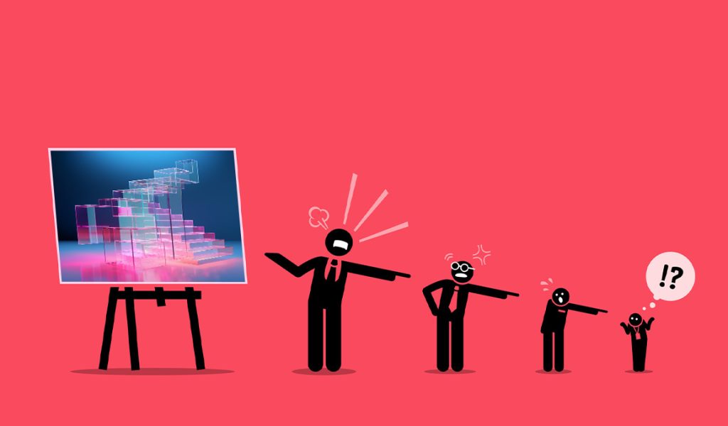
9.Misalignment: Elements that need to be properly aligned can create a disjointed and unprofessional appearance in the graphic.

10.Unnecessary Elements: Incomplete graphics may include decorative or extraneous elements that serve no purpose and distract from the core message.
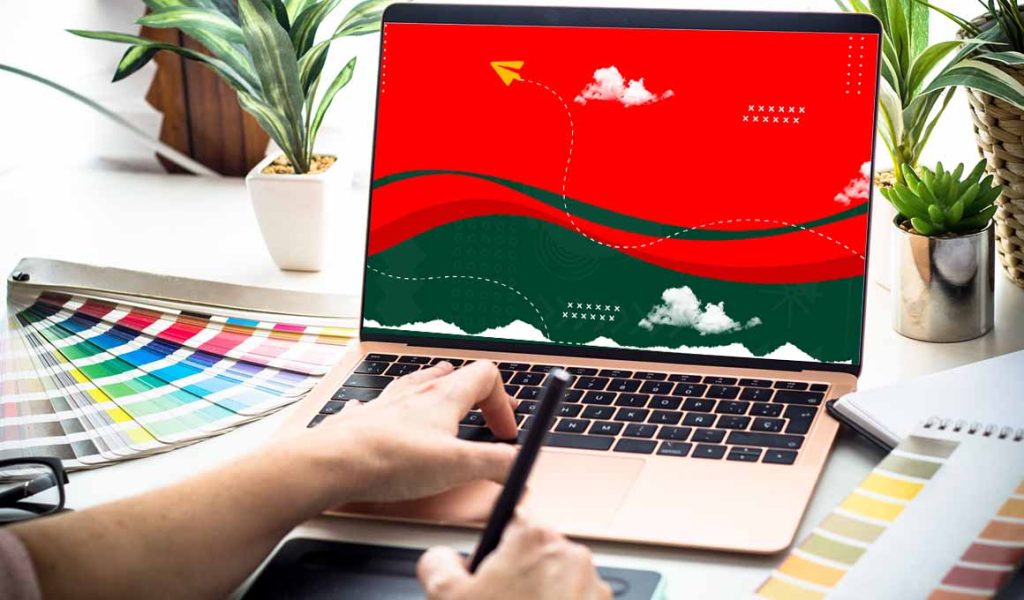
As a graphic designer, I always aim to create complete and compelling graphics that effectively communicate the message while maintaining a high standard of aesthetics and design principles.
Is Graphics Can be a successful Business ?
Once considered a niche profession, graphic design has evolved into a thriving industry with the potential for lucrative business opportunities. As more brands recognize the importance of visual communication in the digital age, the demand for skilled graphic designers continues to rise. Let's explore why graphic design can be a successful business and explore some influential brands that have shaped the industry.
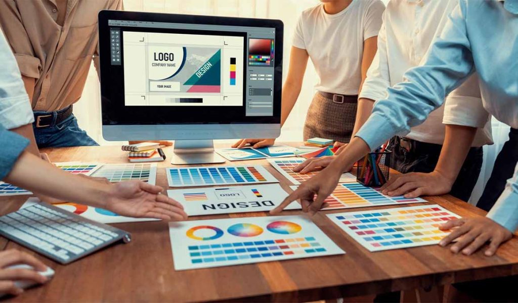
The Business Potential of Graphic Design:
- Growing Demand: In our visually-driven world, businesses across various industries understand the significance of compelling design. From branding and marketing materials to web and app interfaces, the demand for high-quality graphic design is ever-expanding.
- Online Presence: The digital landscape has amplified the need for captivating online content. Businesses require engaging social media graphics, website design, and multimedia presentations to stand out in the crowded online marketplace.
- Diverse Client Base: Graphic designers have the opportunity to work with a diverse range of clients, from startups and small businesses to multinational corporations and nonprofit organizations. This diversity offers a broad spectrum of projects and income potential.
- Freelancing Opportunities: Many graphic designers opt for freelance careers, giving them flexibility in choosing projects and clients. Freelancing allows designers to take control of their schedules and income.
- Passive Income Streams: Designers can create and sell digital assets like stock graphics, templates, and fonts through online marketplaces. This offers a source of passive income alongside client work.
- Global Reach: The internet has made it possible to work with clients worldwide. A successful graphic design business can tap into a global client base, expanding earning potential.
Influential Graphic Design Brands:
1.Adobe:

- Adobe is synonymous with graphic design software. Its Creative Cloud suite, including Photoshop, Illustrator, and InDesign, is a staple for designers worldwide.
- Adobe Stock provides a vast library of stock photos, videos, and templates catering to designers' resource needs.
- Adobe's influence extends to eLearning with Adobe Captivate, empowering designers to create interactive and engaging courses.
2.Sketch:
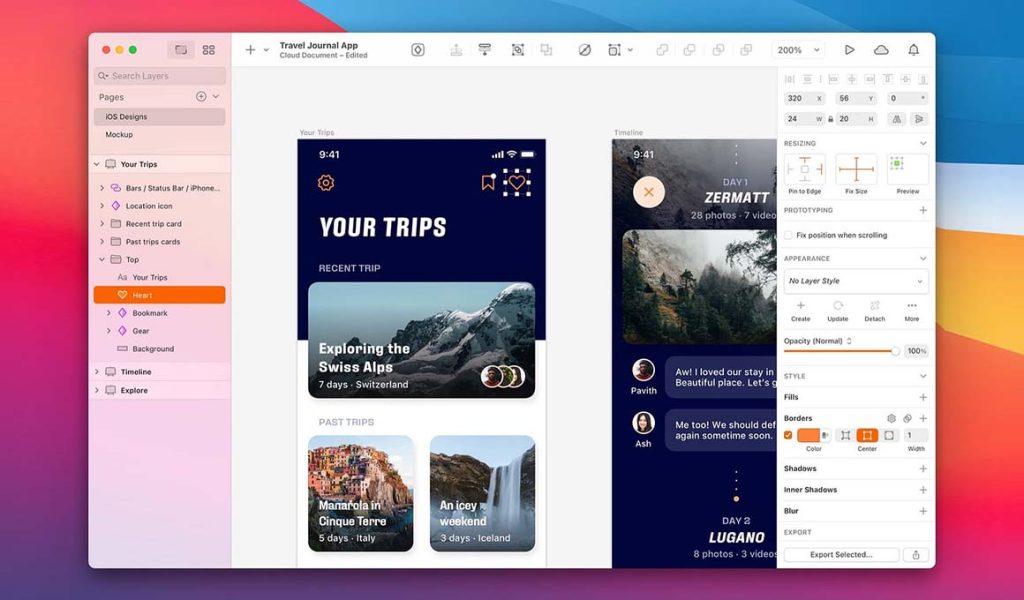
- Sketch is renowned for its vector-based design tool tailored for digital product designers. It simplifies user interface and user experience (UI/UX) design.
- Sketch's collaborative features and third-party plugins enhance productivity and innovation in the design process.
3.CorelDRAW:
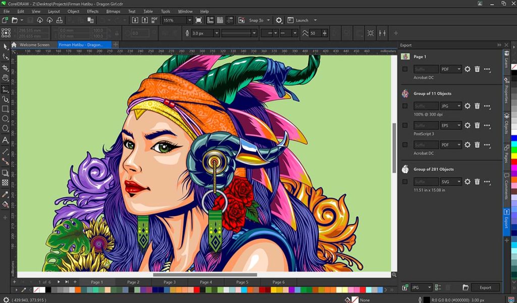
- CorelDRAW has been a graphic design industry stalwart for decades. It offers a comprehensive suite of design and illustration tools.
- CorelDRAW's versatility extends to vector illustration, layout design, photo editing, and typography.
4.Canva:
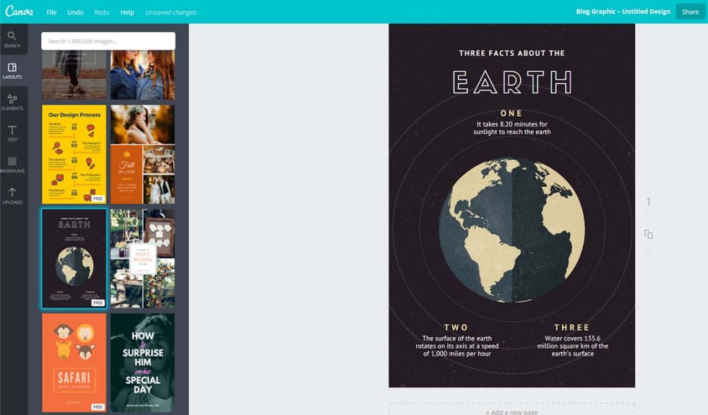
- Canva has democratized graphic design by providing accessible, user-friendly design tools for professionals and beginners.
- Canva's extensive template library empowers users to create stunning designs for social media, marketing materials, and more.
Success Stories in Graphic Design:
1.Sagmeister & Walsh: This New York-based design firm, founded by Stefan Sagmeister and Jessica Walsh, has garnered global recognition for its innovative and provocative design projects. They've worked with major clients like HBO and Levi's.

2.Jessica Hische: A renowned lettering artist and designer, Jessica Hische has worked with prestigious clients like Apple, Penguin Books, and The New York Times. Her work spans book covers, branding, and intricate typography.

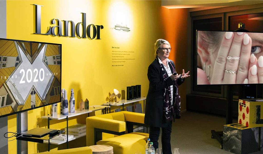
3.Landor: Landor, a global brand consulting and design firm, has shaped the identities of some of the world's most iconic brands, including Coca-Cola, FedEx, and BMW.
4.Freelancers and Small Studios: Countless freelance graphic designers and small design studios have built successful businesses by specializing in niches like logo design, web design, or packaging design. They often leverage online platforms to reach clients worldwide.

Graphic design is not just an artistic endeavor; it's a thriving business sector with ample opportunities for success. The ever-increasing demand for captivating visuals and the availability of powerful design tools make it possible for graphic designers to turn their passion and creativity into a profitable venture. Whether freelancing, working with global brands, or creating digital assets, graphic design offers a diverse and rewarding path to business success.
What Approach to go with Traditional or Modern Tech?
In the dynamic realm of graphic design, creative professionals often find themselves at a crossroads when choosing between traditional and modern approaches. Each Approach comes with its unique set of tools, techniques, and philosophies, and deciding which path to follow can significantly impact the outcome of a design project. In this exploration, we'll delve into the strengths and characteristics of both traditional and modern graphic design approaches, helping you understand when to embrace the best of both worlds and when to choose based on your project's specific needs.
The Traditional Approach: Timeless Foundations of Graphic Design
Rooted in history, the traditional approach to graphic design draws inspiration from classic design principles and techniques. It honors the time-tested methods that have defined the field for centuries.
- Typography Mastery:
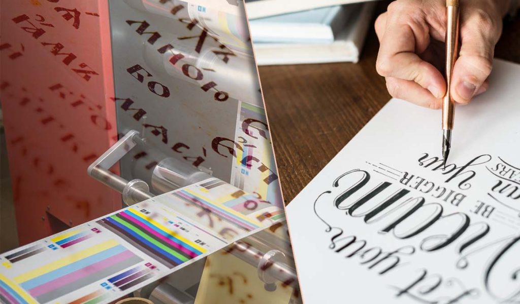
One of the cornerstones of traditional graphic design is typographic excellence. Designers in this school of thought are well-versed in the nuances of typefaces, kerning, leading, and letterforms. They understand the power of typography in conveying meaning, mood, and hierarchy in design.
- Handcrafted Illustrations and Artwork:

Traditional designers often create illustrations and artwork by hand, using drawing, painting, and printmaking techniques. This approach allows for a unique and personalized touch in design, evoking nostalgia and a sense of craftsmanship.
- Grid-Based Layouts:
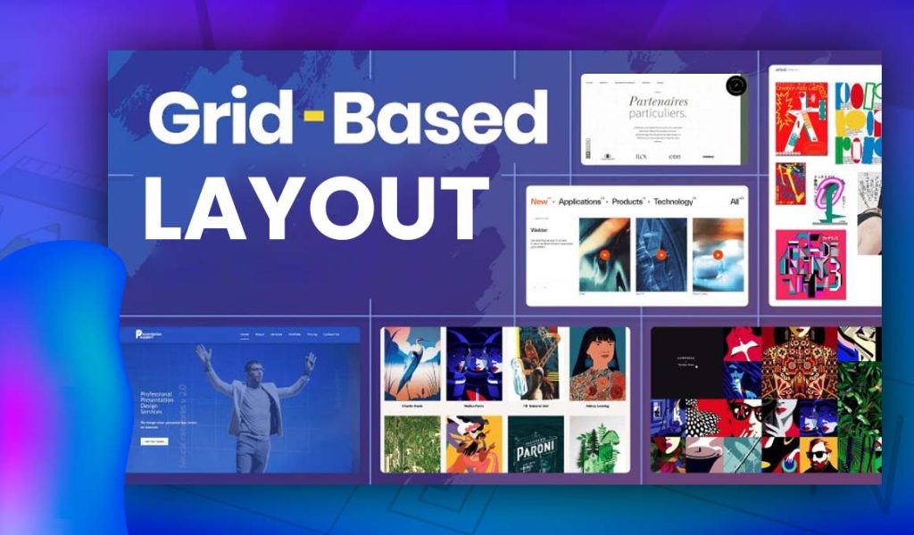
The grid system is a fundamental tool in traditional design. It provides structure and order to layouts, helping designers achieve balance, consistency, and readability. Grids have been used for centuries to create aesthetically pleasing designs.
- Attention to Detail:

Traditional designers are known for their meticulous attention to detail. Every element in a composition is carefully considered, from the choice of paper and ink to the precise placement of graphics and text.
- Craftsmanship and Tangibility:

Traditional design often results in physical, tangible artifacts, such as posters, books, and packaging. This approach appeals to those who appreciate the tactile qualities of printed materials and the craftsmanship involved in their production.
The Modern Approach: Innovation in the Digital Age
With the advent of technology, the modern approach to graphic design has emerged as a dynamic force, embracing digital tools, interactivity, and multimedia to create innovative and impactful designs.
- Digital Tools and Software:
Modern designers harness the power of digital tools and software, such as Adobe Creative Cloud, Sketch, and Figma. These platforms enable efficient design workflows, precise adjustments, and real-time collaboration.
- Responsive and Interactive Design:
In the digital age, responsive and interactive design is essential. Modern designers create websites, apps, and user interfaces that adapt seamlessly to various devices and interactions. This approach focuses on user experience and functionality.
- Animation and Multimedia:
Modern graphic design often incorporates animation, video, and audio elements to engage and captivate audiences. These multimedia components enhance storytelling and user engagement in ways traditional design cannot achieve.
- Minimalism and Simplicity:
Modern design often embraces minimalism, favoring clean lines, simplicity, and ample whitespace. This approach prioritizes clarity and focuses on core messaging.
- Global Accessibility:
The digital realm offers global reach. Modern designers can quickly create and distribute designs to a worldwide audience, making connecting with diverse markets and cultures easier.
The Synthesis: Bridging the Gap Between Traditional and Modern
While traditional and modern approaches in graphic design have their distinct strengths, successful designers often find a way to merge these two worlds. Here are some strategies for achieving this synthesis:
- Hybrid Skillsets:
Many designers today possess both traditional and modern skillsets. They understand the foundations of typography, layout, and composition while leveraging digital tools for efficiency and innovation.
- Contextual Design:
Choosing between traditional and modern approaches depends on the project's goals and target audience. Some projects may benefit from a traditional, timeless aesthetic, while others demand a modern, dynamic design.
- Experimentation:
Exploring both traditional and modern techniques encourages creativity and innovation. Designers who embrace experimentation find new ways to push the boundaries of graphic design.
- Collaboration:
Collaborating with professionals from diverse design backgrounds can lead to fresh perspectives and a fusion of traditional and modern elements in design projects.
- Lifelong Learning:
The world of graphic design is constantly evolving. Successful designers commit to continuous learning and adaptation, staying informed about emerging trends and technologies.
The choice between a traditional or modern approach in graphic design should not be seen as a binary decision but as a spectrum of possibilities. Both approaches offer valuable tools and techniques that can enhance the impact and effectiveness of a design project. By understanding the strengths of each Approach and their respective contexts, designers can create visually compelling and meaningful designs that resonate with audiences in the ever-evolving landscape of graphic design. Ultimately, the most successful designers embrace the best of both worlds, blurring the lines between tradition and innovation to create truly timeless designs.
Learning Has No Age!
Absolutely, learning knows no age, and mastering these essential aspects of graphic design can be a lifelong journey. Let's delve into each of these components to complete your understanding of graphic design:
- Tools:
- Tools in graphic design encompass both traditional and digital instruments. Traditional tools include pencils, brushes, and markers for sketching and drawing. Digital tools include software like Adobe Creative Cloud, Sketch, and CorelDRAW, which enable designers to create and manipulate digital graphics.
- Vectors:
- Vectors are graphics created using mathematical equations, defining shapes and lines. Unlike raster graphics (pixels), vectors can be scaled infinitely without losing quality. Tools like Adobe Illustrator are commonly used for vector graphics.
- Illustrations:
- Illustrations are visual representations that convey a message, idea, or story. They can be hand-drawn or created digitally. Illustrations add a unique and personal touch to graphic designs.
- Layout:
- Layout refers to arranging text, images, and other elements within a design. A well-planned layout ensures visual hierarchy, readability, and a pleasing overall composition.
- Photo Editing:
- Photo editing involves enhancing or modifying images to achieve the desired effect. Software like Adobe Photoshop allows designers to adjust colors, retouch photos, and apply various effects.
- Typography:
- Typography is selecting and arranging typefaces to convey a message effectively. It includes choosing fonts, setting type size, leading, kerning, and aligning text for readability and aesthetics.
- Collaboration:
- Collaboration is essential in graphic design, especially for team projects. Designers work with clients, copywriters, photographers, and other professionals to bring a design project to fruition. Effective communication and teamwork are key.
- Lighting:
- Lighting plays a crucial role in photography and 3D design. Understanding how light interacts with objects helps create realistic and visually appealing graphics. Lighting techniques include natural, studio, and ambient lighting.
- White Space:
- White or negative space is the empty area between design elements. It provides a visual breathing room, enhances readability, and contributes to a clean, uncluttered design.
- Templates:
- Templates are pre-designed layouts or files that are starting points for various design projects. They save time and provide consistency. Designers often customize templates to suit specific needs.
Mastering these aspects of graphic design requires ongoing practice, experimentation, and a commitment to learning. Whether you're a beginner or an experienced designer, there's always room for growth and improvement in each area.
Bottom Line
graphic design is a multifaceted field that offers endless opportunities for creativity and expression. Learning and mastering its various components, including tools, vectors, illustrations, layout, photo editing, typography, collaboration, lighting, white space, and templates, is a lifelong journey that knows no age limits.
Understanding the tools and software available, such as Adobe Creative Cloud, is essential for traditional and digital design. Vectors provide flexibility and scalability, while illustrations add a personal touch to designs. Layout, typography, and photo editing are crucial for visually appealing and effective compositions.
Collaboration and effective communication are key to successful graphic design projects, as designers work with clients and other professionals to bring their ideas to life. Understanding lighting techniques and the importance of white space contributes to creating polished and professional designs.
Lastly, templates serve as valuable starting points and time-savers, allowing designers to customize and adapt designs to specific needs.
Whether you're just starting your journey in graphic design or have years of experience, these components form the foundation of this dynamic field. Embracing the idea that learning has no age, graphic designers can continuously refine their skills and stay at the forefront of this ever-evolving industry. With dedication, practice, and a commitment to excellence, designers can create visually compelling and impactful designs that leave a lasting impression on audiences of all ages.


